Rethinking tap water
iStream
Some description
Role
Designer
Date
2022
UX Design
Designing Interaction
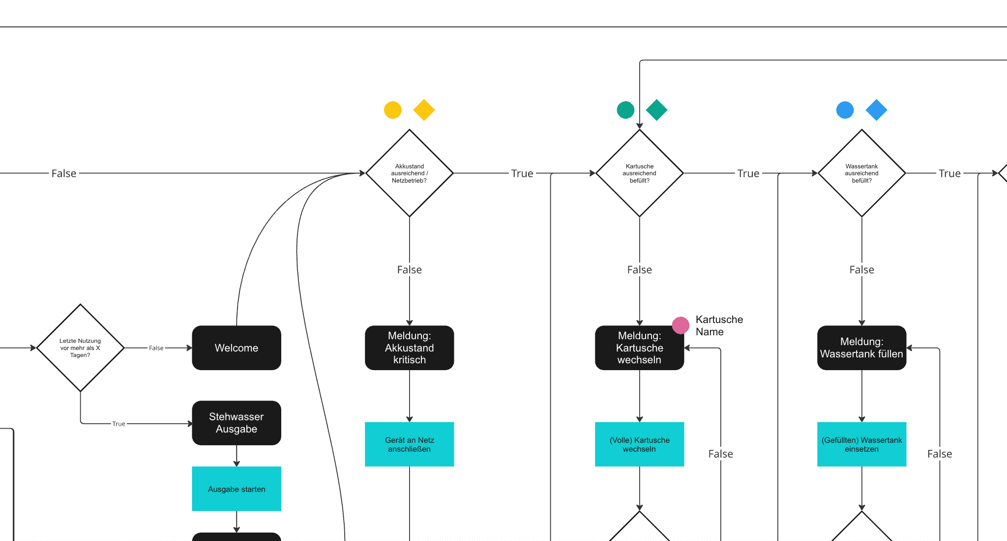
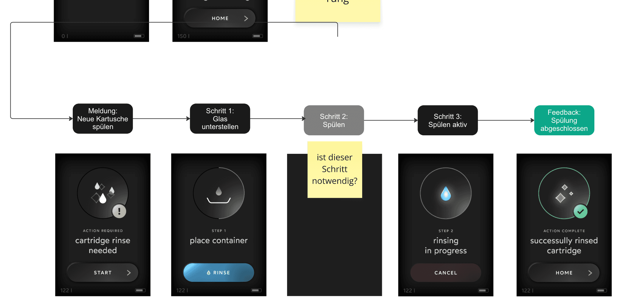
The user flow for the mineral water dispenser began by identifying the core interactions: selecting mineral types and dosage levels, adjusting temperature and volume preferences, confirming settings before dispensing, and receiving feedback on completion or alerts. The designer traced several scenarios including routine use, troubleshooting when sensors detected cartridge depletion, and saving customized profiles. Each path accounted for potential edge cases—such as when the system needs maintenance or when users accidentally interrupt dispensing—ensuring the journey remained straightforward across all situations.
Wireframing
Information Design
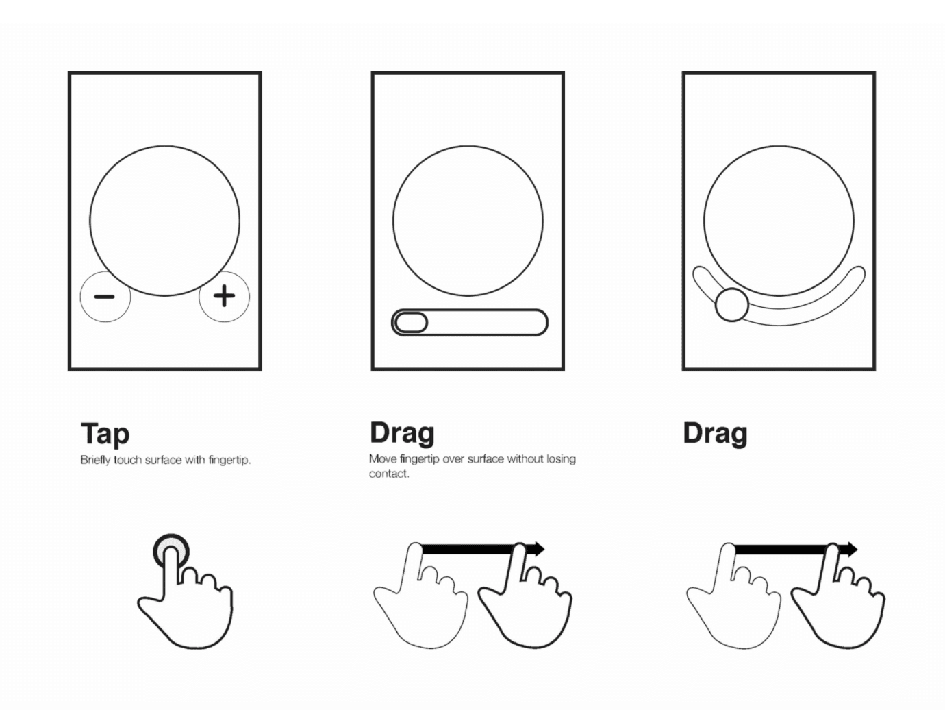
With the flow mapped out, wireframing established the physical arrangement of controls and information displays. Grayscale layouts positioned mineral selection prominently near the screen, placed confirmation buttons within easy reach, and allocated space for status indicators showing cartridge health and water quality. At this stage, emphasis fell on spatial logic and task sequence rather than visual polish—the goal being to validate that users could locate essential functions intuitively without needing explanatory labels.
High fidelity Prototyping
Refining
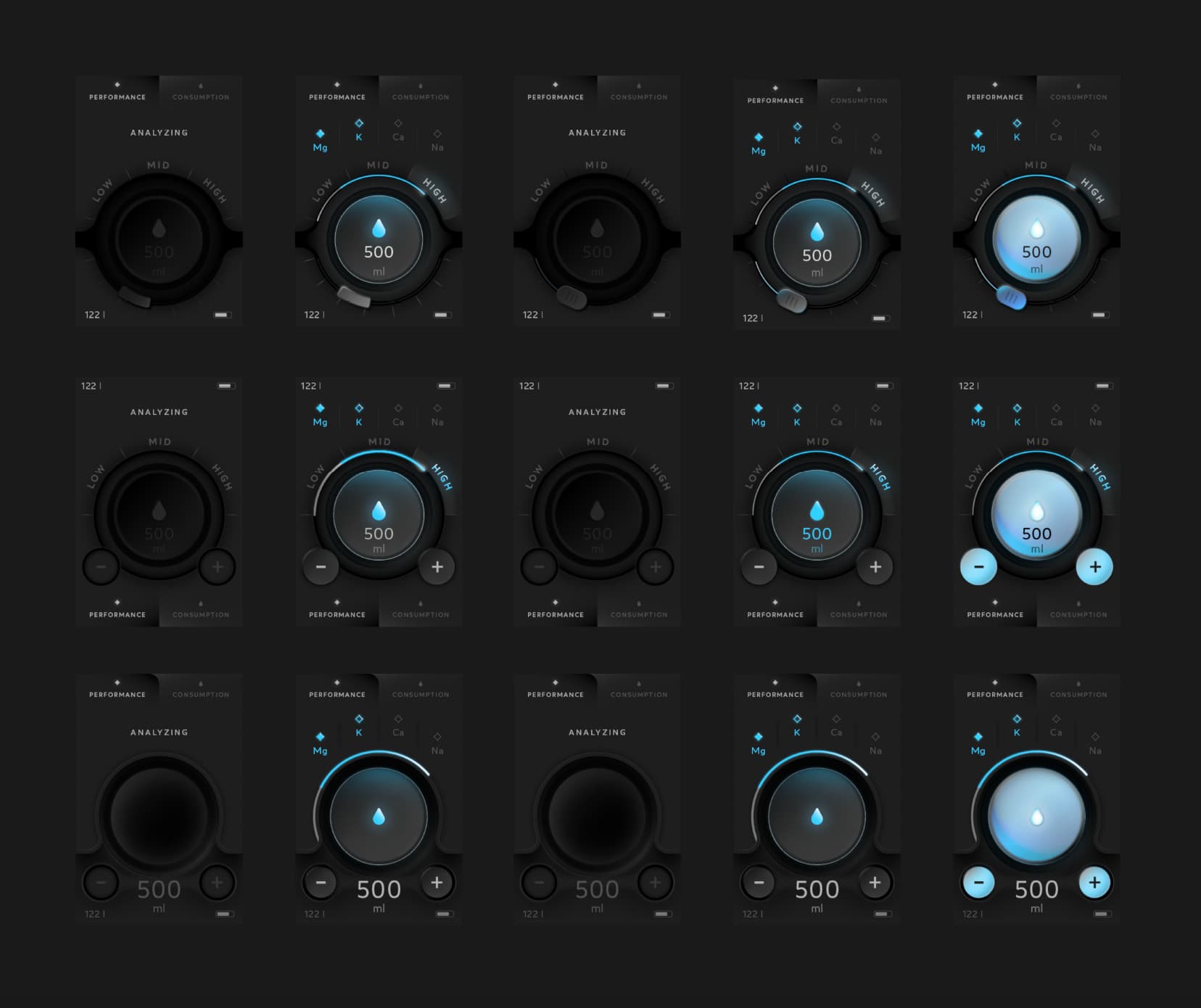
The final phase brought the interface to life through polished visuals and interactive simulations. Colors reflected the product's clean, modern aesthetic, while animations illustrated real-time feedback like progress bars during filtration cycles and dynamic readouts displaying current mineral concentrations. Buttons responded with tactile cues, transitions between screens felt fluid, and error states provided clear guidance. This version enabled meaningful usability testing where observers could watch actual interactions unfold, revealing friction points that might have remained invisible in earlier stages.